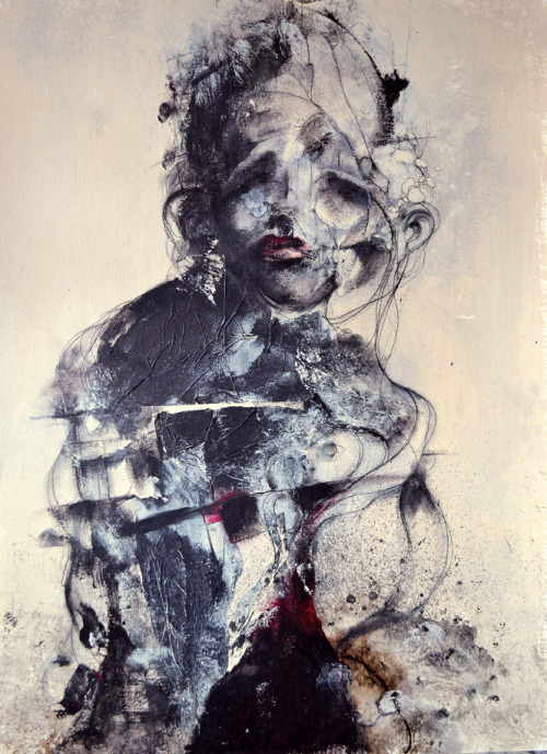
Paul Romano
 has served as one of my biggest inspirations for design. The first time I saw his art on the cover of Mastodon's album
Blood Mountain
(pictured left), and I've been following him since. His interest in
ancient mythos and arts and his ability to combine both styles and
techniques effectively is what first attracted me to his work. I share
the same sentiment and have always been fascinated with old, archaic,
mysterious, and otherwise ancient art, culture, history, etc.
Romano
works in several different styles and mediums, moving from screen
printing to digital art to photography, but his art is always
identifiable and carries his unique style. One of his most common tools
is the intricate, swirling lines that swim and float across his designs.
He seems to pull a lot from the medieval Christian monks who would
intricately decorate Bibles and transcriptions in his line work.
Elements of medieval Japanese and Chinese murals can also be found in
his art. Here are a few examples illustrating the presence of these
themes in his work:
Romano's fixation on mythology and the according art style affords him a special spot in my list of influences.

 Guy Laramee works as a photographer, writer, and sculptor. In his most recent and noted project, Laramee carves landscapes from books. The sculptures shoot up from the pages, creating mountain ranges and temples seated on the peaks. The sense of scale Laramee achieves is particularly impressive. Despite the relatively small physical size of the pieces, each one feels huge on a perceptual level. The high degree of detail and careful use of texture in each part of the landscapes certainly contributes to this illusion of size. The careful lighting in the photographs was also noticeably well done and adds to this effect.
 It's important to note that Laramee uses a subtractive approach when creating his sculptures. He only carves from the pre-existing material originally found in the book and uses no additive features (aside from some paints and glues). This design choice is an extension of the concept behind his work. In his artist's statement for the series he discusses the nature of progress and evolution. He questions the nature of the traditional additive model of progress where we, as beings, consider growth/evolution/progress/etc a process in which we must add something to move forward. Laramee theorizes that "knowledge could very well be an erosion instead of an accumulation". This idea is especially relevant in an age where we are expected to take in and process huge amounts of information. Laramee's series is, by far, one of my favorite series I've looked at for this class. Both parts (the concept and the sculptures) work so well together but are strong separately as well - a rare trait in art (in my opinion, at least).